Debug Visualizer for Visual Studio Code
Cái này là plugin tích hợp thư viện của Plotly vào VSCode. Trước giờ mình mới chỉ thử Plotly cho Jupyter Notebook python thôi. Giờ thấy VSCode cũng tích hợp được cái này cho Javascritp để hiển thị các biến, biểu đồ,..
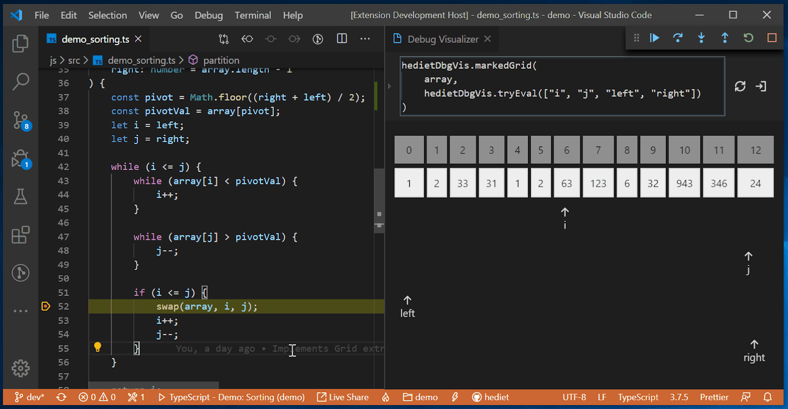
Túm lại thì VSCode Debug Visualizer là một phần mở rộng VSCode cho phép bạn trực quan hóa cấu trúc dữ liệu trong trình soạn thảo của mình. Điều này có thể hữu ích để hình dung các giá trị đã xem trong quá trình gỡ lỗi. Tôi thấy tiện ích mở rộng có thể hữu ích để hình dung các lô, bảng, mảng, biểu đồ và cây..
Thấy có vẻ hấp dẫn đó :v
Cài Debug Visualizer for Visual Studio Code
Search Debug Visualizer hoặc vô link này để cài
https://marketplace.visualstudio.com/items?itemName=hediet.debug-visualizer

Một số mẫu ví dụ
Để vọc nó mọi người có thể tham khảo thêm ở đây
https://addyosmani.com/blog/visualize-data-structures-vscode/
Xem thêm về thư viện plotly
https://plotly.com/javascript/
https://hediet.github.io/visualization/?darkTheme=1
VSCode Debug Visualizer is a VSCode extension that allows you to visualize data structures in your editor. This can be useful for visualizing watched values during debugging. I've found the extension can be helpful to visualize plots, tables, arrays, histograms and trees.
Once the extension is installed, open some relevant scripts then navigate to the command palette and go to Debug Visualizer: New View. This view allows you to enter expressions that are visualized while stepping through your code. It's very similar to VS Code's watch view, with the core difference being that results are visualized rather than displayed in a text format.
If you have a selection of text you want to visualize, Debug Visualizer: Use Selection as Expression can evaluate the current text you have selected in the last debug visualizer window you opened.
Official examples
The JavaScript examples for VSCode Debug Visualizer are included in the main repository. To get started with them, check you have yarn and node installed, then:
- Clone the repository locally. Navigate to the demos/js directory once that's done.
- Run yarn to install the dependencies. I needed to manually run yarn add @hediet/debug-visualizer-data-extraction to get everything working.
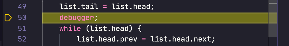
- Open the repo up in VSCode and select an example. e.g demo_doubly-linked-list.ts
Add a breakpoint / debugger statement somewhere in the source (e.g line 50).
Go to Run > Start Debugging and select an environment (e.g Node.js (preview)).

From the command-palette, select Debug Visualizer: New View.
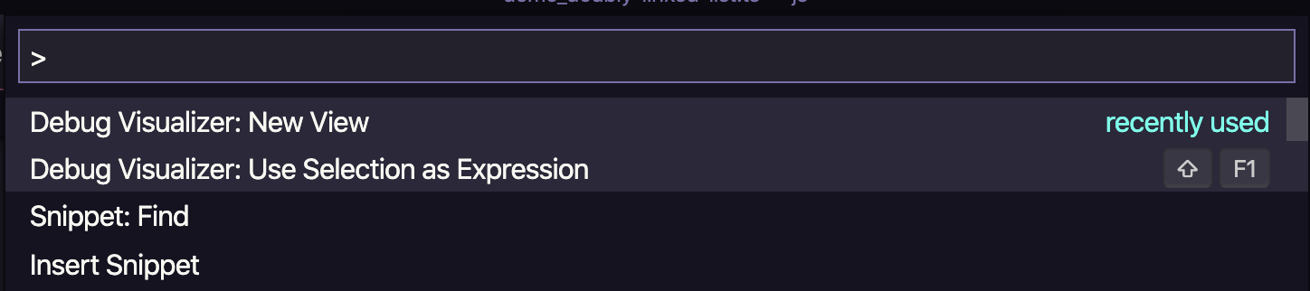
You should now be able to enter visualize() into the prompt and see a plot visualization in your editor for the doubly linked list:

Try your own examples
Before trying the extension on your own examples, note that expressions you wish to visualize must both evaluate to a JSON Object string and match the schema of one of the extension's supported visualizers (outside of simple data types, like arrays). In the examples below, note the "kind": { "graph": true }, "kind": { "plotly": true } etc. entries which are a part of this schema.
Below you can find some of the code snippets I used when testing out the extension.
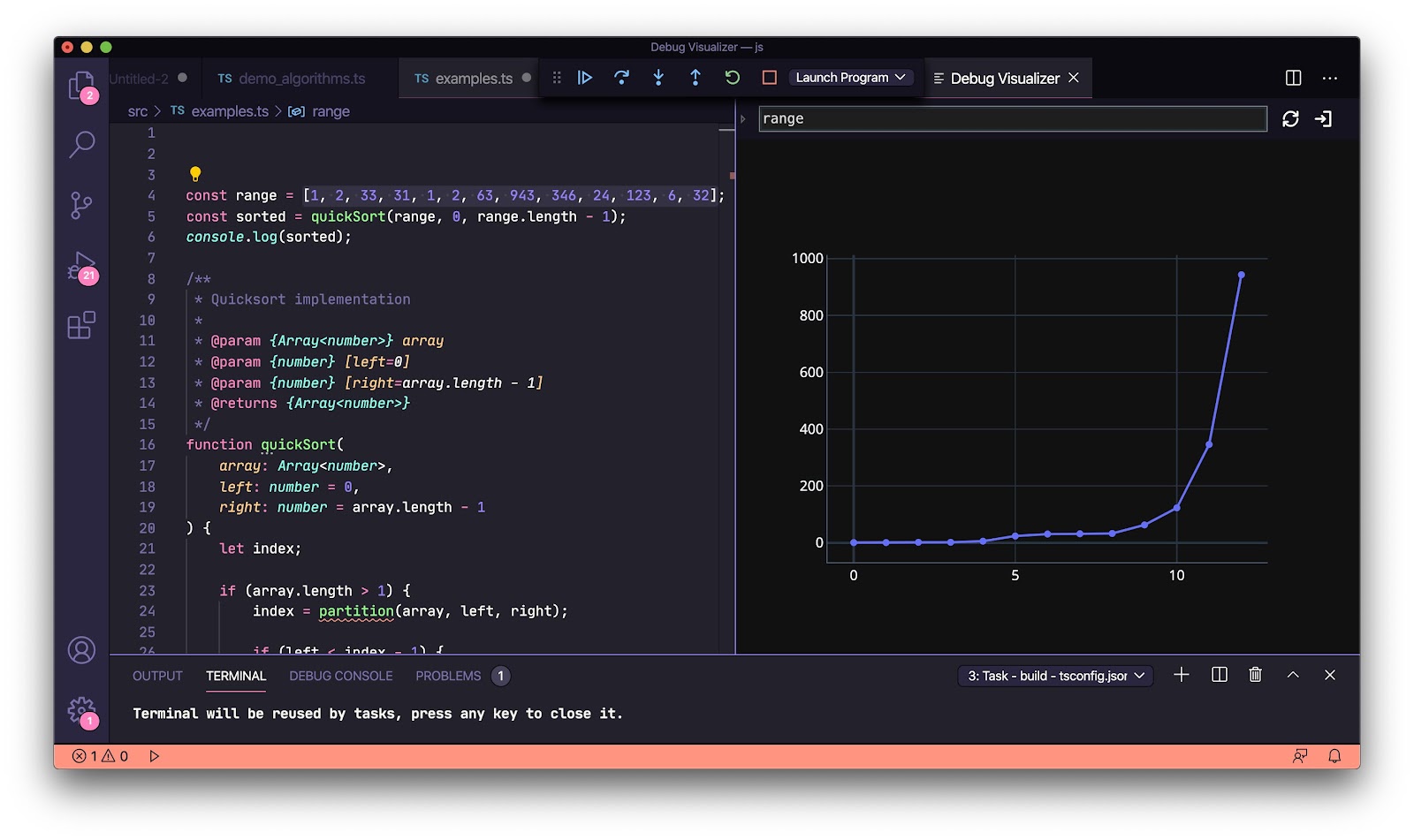
Arrays
| const range = [1, 2, 33, 31, 1, 2, 63, 943, 346, 24, 123, 6, 32]; |
Dynamic data from a REST API
Data that is visualized doesn't need to be static. As demonstrated in the fetch() example below, it can also come from a REST API.
| const fetch = require('node-fetch'); fetch('https://jsonplaceholder.typicode.com/users') .then((response) => response.json()) .then((json) => { debugger; }); |
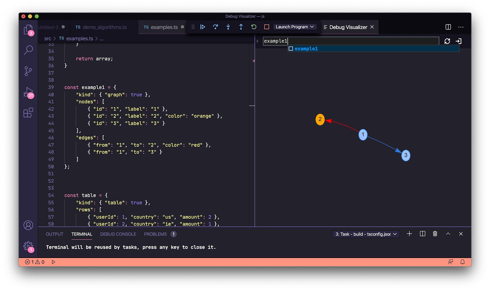
Graphs
| const example1 = { "kind": { "graph": true }, "nodes": [ { "id": "1", "label": "1" }, { "id": "2", "label": "2", "color": "orange" }, { "id": "3", "label": "3" } ], "edges": [ { "from": "1", "to": "2", "color": "red" }, { "from": "1", "to": "3" } ] }; |
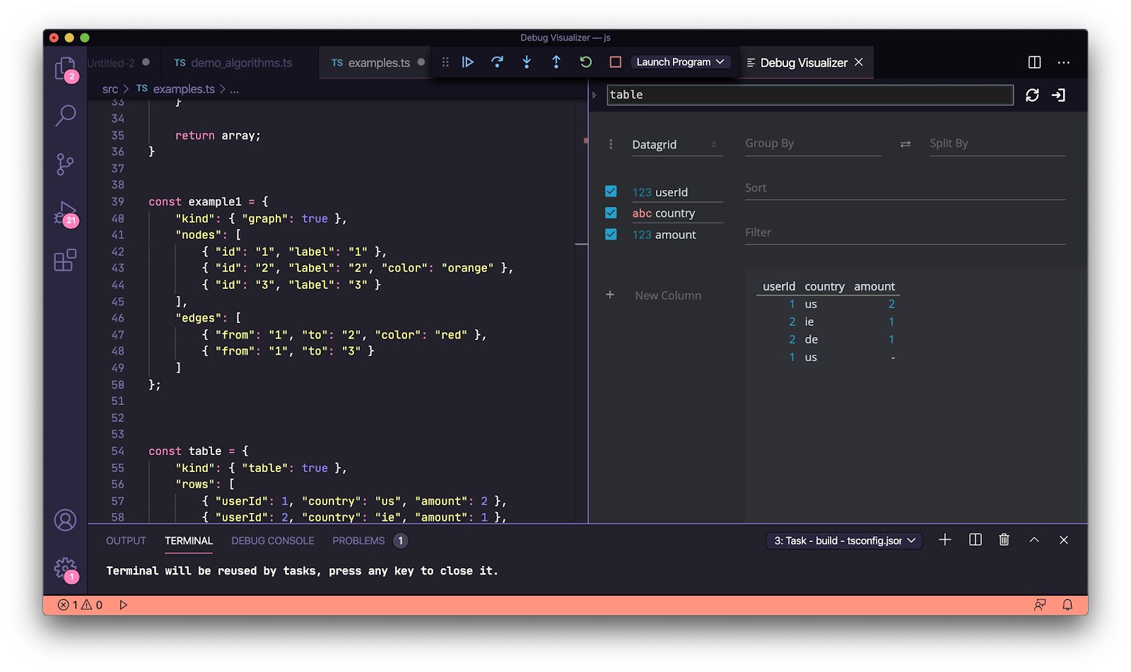
Tables
| const table = { "kind": { "table": true }, "rows": [ { "userId": 1, "country": "us", "amount": 2 }, { "userId": 2, "country": "ie", "amount": 1 }, { "userId": 2, "country": "de", "amount": 1 }, { "userId": 1, "country": "us" } ] }; |
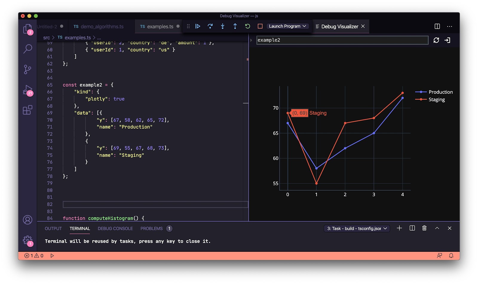
Plotly graphs
"kind": { "plotly": true } allows you to leverage the Plotly graphing and data-science library for visualizations.
| const example2 = { "kind": { "plotly": true }, "data": [{ "y": [67, 58, 62, 65, 72], "name": "Production" }, { "y": [69, 55, 67, 68, 73], "name": "Staging" } ] }; |
Plotly histograms
| function computeHistogram() { const x1 = []; const x2 = []; const y1 = []; const y2 = []; let k = 0; for (let i = 1; i < 500; i++) { k = Math.random(); x1.push(k * 5); x2.push(k * 10); y1.push(k); y2.push(k * 2); } const trace1 = { x: x1, y: y1, name: 'control', autobinx: false, histnorm: "count", marker: { color: "rgba(255, 100, 102, 0.7)", line: { color: "rgba(255, 100, 102, 1)", width: 1 } }, opacity: 0.5, type: "histogram", xbins: { end: 2.8, size: 0.06, start: .5 } }; const trace2 = { x: x2, y: y2, autobinx: false, marker: { color: "rgba(100, 200, 102, 0.7)", line: { color: "rgba(100, 200, 102, 1)", width: 1 } }, name: "experimental", opacity: 0.75, type: "histogram", xbins: { end: 4, size: 0.06, start: -3.2 } }; return { "kind": { "plotly": true }, "data": [trace1, trace2], "layout": { bargap: 0.05, bargroupgap: 0.2, barmode: "overlay", title: "Sampled Results", xaxis: { title: "Value" }, yaxis: { title: "Count" } } }; } let example3 = computeHistogram(); |

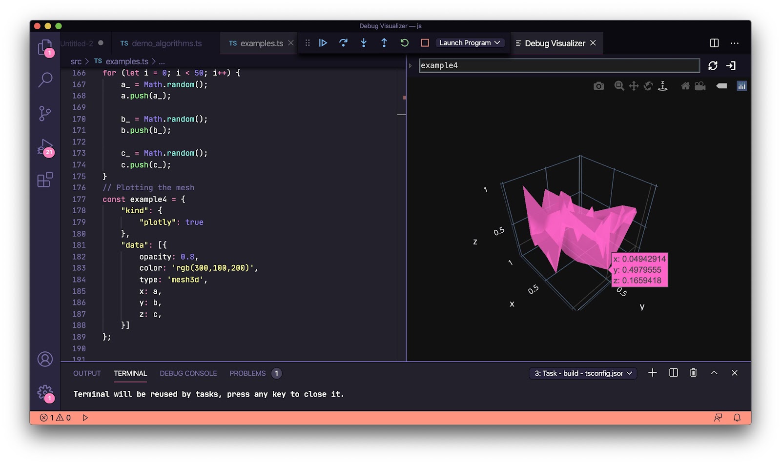
Plotly 3D-mesh graphs
| // Generate random data let a = []; let b = []; let c = []; let a_ = 0; let b_ = 0; let c_ = 0; for (let i = 0; i < 50; i++) { a_ = Math.random(); a.push(a_); b_ = Math.random(); b.push(b_); c_ = Math.random(); c.push(c_); } // Plot the mesh const example4 = { "kind": { "plotly": true }, "data": [{ opacity: 0.8, color: 'rgb(300,100,200)', type: 'mesh3d', x: a, y: b, z: c, }] }; |
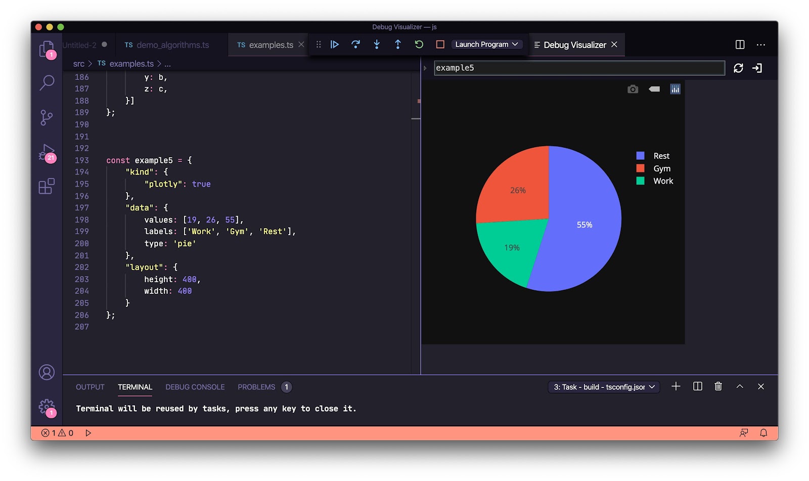
Plotly pie-charts
| const example5 = { "kind": { "plotly": true }, "data": { values: [19, 26, 55], labels: ['Work', 'Gym', 'Rest'], type: 'pie' }, "layout": { height: 400, width: 400 } }; |
Thanks to Henning Dieterichs for creating the extension. If you found this helpful, you may also be interested to try out the draw.io VSCode extension he also wrote.
Hết rồi :v
soiqualang_chentreu